Tuesday, March 29, 2011
Shading & Highlighting using the Burn & Dodge Tools...
This tutorial was written for Barry, who asked me about shading with the Burn & Dodge.
If you'd like me to do a tutorial for you, please email me at justcreations@ymail.com and I'll do my best for you!
I will be doing another tutorial on how to shade and highlight another way. Stay tuned!!! :)
This tutorial was written for Barry, who asked me about shading with the Burn & Dodge.
If you'd like me to do a tutorial for you, please email me at justcreations@ymail.com and I'll do my best for you!
I will be doing another tutorial on how to shade and highlight another way. Stay tuned!!! :)
You can download the Button Template used in this tutorial so you can follow along.
It contains the PSD, PSP and PNG formats.
It is also CU OK.
Download template here!
We need to color the button first.
We're going to use the Blend Options for this tutorial (I'll do another tutorial using the "Image - Fill" way)
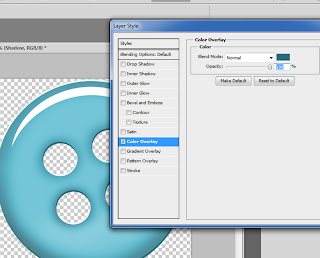
Double click on the Button Layer Thumbnail (as indicated by the arrow)
This will bring up the Blend Options.
Go to the Color Overlay and choose a color you like.
Click OK when you're done.
We need to flatten the layer we just added the color to.
(the reason we need to do this is because the Burn/Dodge will not show up if you have Blend Options added to the layer.
Duplicate the Button layer you just added the color to.
Add a blank New Layer directly below the Duplicated Button Layer (as indicated by the arrows)
Highlight both these layers and Merge them Visibly (CTRL+E)
Choose the Burn Tool (1)
Choose a soft brush (2)
Put the Range to Midtones (3)
Exposure should be 50%
Make sure you're on the colored Button (1)
Take your brush and go around the edges of the button (2)
and around the middle holes of the button (3)
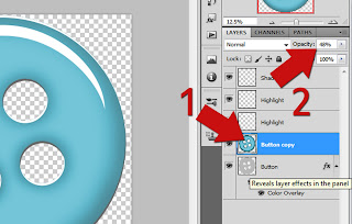
The burn tool might be more then you want so you'll want to lower the opacity of the layer (1)
using the Opacity bar (2). Put it to where you think it looks best on your button.
The shading is done (1)
Now highlight the bottom Button (original) layer. Highlight the layer you just did the shading on and the duplicated original layer (2) and merge these (CTRL+E)
Duplicate your merged image (1) so we can add some highlights (dodge)
We're going to add the highlights to the bottom of the button.
Now choose the Dodge Tool (located in the Fly Out with the Burn tool)
Use the settings as I have
Soft Brush
Range: Midtones
Exposure: 50%
Lower the opacity of the layer you just higlighted until you like how it looks (1)
Highlight the First Button and Second Button you worked on and Merge them (CTRL+E)
Now we need to color the Shadow layer (1)
Double click on the Shadow Layer (2) to bring up the Blend Mode
Go to Color Overlay and choose a darker shade of the color you used for the Button.
Click OK when you're done.
Now we'll soften the highlights that are in the ridges of the button (1)
Go to the Highlight layer that is just for the ridges (2) (Turn off the layer just to see if you're on the right layer, turn it on again when you're sure you're on the right one)
Change the Blend Mode to "Soft Light" (3)
That's it...
NOTE: The highlight (half moon) that you see above can be altered if you think it's too harsh.
Simply go to this layer and change the Blend Mode to "Soft Light" or ???
You will need to play with these settings depending on the color and/or pattern you use for the button.
Each Pattern and Color needs to be played with until you like what you see...
Also, you can lower the opacity to make the highlight seem more realistic... The way I have it is to make the button appear as if it's glass.
I would love to see what you do with this tutorial.
Justie
Thank you!
Here is the Template I created for this tutorial.
It is CU friendly.
Download it here!
Subscribe to:
Post Comments (Atom)
Questions or Suggestions?
If you have any suggestions or questions about my tutorials please send me an E-Mail justcreations@ymail.com
Thank you!
Thank you!
Blog Archive
-
▼
2011
(17)
-
▼
March
(7)
- How to Make Swirl Designs (and Freebie Examples at...
- Shading & Highlighting using the Burn & Dodge Too...
- Coloring an Extracted Greyscale Element using Masks
- Coloring without going into the Transparent areas ...
- Create a Paper Bolt Preview - Photoshop Tutorial a...
- Banner
- Embossed Paper - Free Photoshop Tutorial and Full ...
-
▼
March
(7)
Contributors
Powered by Blogger.
Labels
- Banner (1)
- Burn (1)
- Cheat Sheets; Highlights; Shading (1)
- Designer Preview; Paper Preview (1)
- Dodge (1)
- Emboss (1)
- Extraction 1 (1)
- Extraction; Shading (1)
- Freebie (4)
- Freebie; Gold; Tutorial (1)
- Glass (1)
- Glossy Button; Highlight (1)
- Glossy Frame; 3D Shading (1)
- Highlight (1)
- Highlights; Shading (1)
- Lights; Tutorial (1)
- Lineart; Recolor; Shading; Coloring Element (2)
- Lineart; Recolor; Shading; Recolor; Shading; Coloring Element (1)
- Recolor; Shading; Coloring Element (3)
- Shading (2)
- Shapes (1)
- Spherize; Shading (1)
- Swirls (1)
- Tutorial (6)


2 comments:
Love it! xx from Brazil
Thank you!@
Post a Comment