Thursday, March 31, 2011
How to Make Swirl Designs (and Freebie Examples at End of Tutorial)
This tutorial is for Rebecca!
Start with a basic swirl shape.
For this instance I'm using the swirl Shape from Scrapbooking Cop (I think... I'm sorry but I can't remember where I got it... If you know, please send me an email so I can give proper credit)
Put your shape out as I have.
Now Duplicate this shape (CTRL+J)
Hit CTRL+T on your Keyboard (Transform) to transform the duplicated image.
Do a Right Mouse Click over the Duplicated Image and cilck on "Flip Horizontal"
Lign your images up like I have here.
Highlight both layers and Merge them together (CTRL+E)
Take the Marquee tool (1) and draw a square around the bottom half of the image (2)
On your keyboard press "CTRL+X (CUT) to delete the bottom half.
Here is what we have so far...
Duplicate this! (CTRL+J)
Now we'll do the CTRL+T and do a right mouse click over the layer and "Flip Vertical"
Lign the middle sections up.
Now Highlight both layers and Merge (CTRL+E)
Duplicate your Merged Layers.
Let's Transform (CTRL+T) (1)
and now we want to Rotate it by 30%
Simply type in 30 (2) and hit Enter
Now Highlight both Layers and Duplicate them (Right Mouse click over the Layers and say "Duplicate Layers")
Now we want to Rotate these.
First do "CTRL+T (Transform)
Right Mouse Click Over the Image and then at the Top do as we did in the previous step, but this time type in 60.
Hit Enter when you're done.
Now Highlight the last 2 Layers and Duplicate them again.
(Right Mouse click over the Layers and say "Duplicate Layers")
Now we want to Rotate these.
First do "CTRL+T (Transform)
Right Mouse Click Over the Image and then at the top do as we did in the previous step, using the same number, 60. Hit Enter when you're done.
Highlight all the Layers and Merge them (CTRL+E)
Now duplicate this newly Merged layer (CTRL+J)
Let's Do the Transform (CTRL+T)
Now go to the top as you did in the previous steps, but let's rotate only by 15 this time.
Hit Enter when you're done.
Highlight both these Layers and you're done.
I'll show you how to do another swirl. At the end I'll show you examples with styles applied.
Here is a basic shape
I believe this shape is from the same set I used above.
I transformed this shape a bit. (CTRL+T) and moved the width in a bit.
Once you have it transformed you'll want to duplicate the layer (CTRL+J)
Now we'll flip the duplicated layer.
CTRL+T (Transform)
Right mouse click over the Image and choose "Flip Vertical"
Hit Enter.
It should already be lined up like I have it here.
If not, line it so you like how it looks.
Highlight both of these layers and merge them (CTRL+E)
Duplicate this newly merged layer (CTRL+J)
Transform (CTRL+T)
Right Mouse click over Image and "Flip Vertical"
Now bring the new layer down and match up the insides as I have here.
Highlight both these layers and merge (CTRL+E)
Duplicate the image (CTRL+J)
Transform (CTRL+T)
Now go to the top and Rotate Image (as we did previously). For this swirl let's move it 30%.
Type in 30 and hit Enter when you're done.
Highlight both these layers and merge them (CTRL+E)
Duplicate the layer you just rotated (CTRL+J)
Now we need to rotate it... Transform (CTRL+T)
Do as you did in the previous step and rotate the image by 30.
Hit Enter when you're done.
Highlight both the layers and merge (CTRL+E)
That's it. They are now ready to add some styles too.
Here are some I've added Styles to.
You can download these to see how they look.
Download the examples here!
Tuesday, March 29, 2011
Shading & Highlighting using the Burn & Dodge Tools...
This tutorial was written for Barry, who asked me about shading with the Burn & Dodge.
If you'd like me to do a tutorial for you, please email me at justcreations@ymail.com and I'll do my best for you!
I will be doing another tutorial on how to shade and highlight another way. Stay tuned!!! :)
This tutorial was written for Barry, who asked me about shading with the Burn & Dodge.
If you'd like me to do a tutorial for you, please email me at justcreations@ymail.com and I'll do my best for you!
I will be doing another tutorial on how to shade and highlight another way. Stay tuned!!! :)
You can download the Button Template used in this tutorial so you can follow along.
It contains the PSD, PSP and PNG formats.
It is also CU OK.
Download template here!
We need to color the button first.
We're going to use the Blend Options for this tutorial (I'll do another tutorial using the "Image - Fill" way)
Double click on the Button Layer Thumbnail (as indicated by the arrow)
This will bring up the Blend Options.
Go to the Color Overlay and choose a color you like.
Click OK when you're done.
We need to flatten the layer we just added the color to.
(the reason we need to do this is because the Burn/Dodge will not show up if you have Blend Options added to the layer.
Duplicate the Button layer you just added the color to.
Add a blank New Layer directly below the Duplicated Button Layer (as indicated by the arrows)
Highlight both these layers and Merge them Visibly (CTRL+E)
Choose the Burn Tool (1)
Choose a soft brush (2)
Put the Range to Midtones (3)
Exposure should be 50%
Make sure you're on the colored Button (1)
Take your brush and go around the edges of the button (2)
and around the middle holes of the button (3)
The burn tool might be more then you want so you'll want to lower the opacity of the layer (1)
using the Opacity bar (2). Put it to where you think it looks best on your button.
The shading is done (1)
Now highlight the bottom Button (original) layer. Highlight the layer you just did the shading on and the duplicated original layer (2) and merge these (CTRL+E)
Duplicate your merged image (1) so we can add some highlights (dodge)
We're going to add the highlights to the bottom of the button.
Now choose the Dodge Tool (located in the Fly Out with the Burn tool)
Use the settings as I have
Soft Brush
Range: Midtones
Exposure: 50%
Lower the opacity of the layer you just higlighted until you like how it looks (1)
Highlight the First Button and Second Button you worked on and Merge them (CTRL+E)
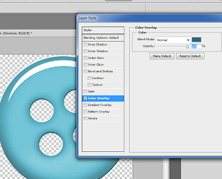
Now we need to color the Shadow layer (1)
Double click on the Shadow Layer (2) to bring up the Blend Mode
Go to Color Overlay and choose a darker shade of the color you used for the Button.
Click OK when you're done.
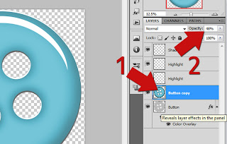
Now we'll soften the highlights that are in the ridges of the button (1)
Go to the Highlight layer that is just for the ridges (2) (Turn off the layer just to see if you're on the right layer, turn it on again when you're sure you're on the right one)
Change the Blend Mode to "Soft Light" (3)
That's it...
NOTE: The highlight (half moon) that you see above can be altered if you think it's too harsh.
Simply go to this layer and change the Blend Mode to "Soft Light" or ???
You will need to play with these settings depending on the color and/or pattern you use for the button.
Each Pattern and Color needs to be played with until you like what you see...
Also, you can lower the opacity to make the highlight seem more realistic... The way I have it is to make the button appear as if it's glass.
I would love to see what you do with this tutorial.
Justie
Thank you!
Here is the Template I created for this tutorial.
It is CU friendly.
Download it here!
Thursday, March 24, 2011
Coloring an Extracted Greyscale Element using Masks
This tutorial was written for Rebecca.
She purchased some Extracted Flowers and now wants to add 2 different colors to them.
She purchased some Extracted Flowers and now wants to add 2 different colors to them.
Open your image.
Duplicate your image as many times as you want differnt colors.
For instance, I want to color this flower 2 different colors so I duplicated my original layer 2 times.
Turn off any layers you're not going to work on right now (1)
Make sure that the layer you're going to work with is highlighted (2)
At the top of the Layer's Pallet is a button with the word Lock right before it. Push this button down (3)
This locks the image so that as you paint it won't spill over to the transparent part of the image.
Choose the color you want to paint with (1)
Choose the Brush Tool (2)
Choose a soft brush size (3)
Change the Mode: to Color (4)
Paint your image with this color
(Don't worry about going into areas that you want another color, we'll fix this in a minute)
Turn off the layer you just worked with and turn back on the next duplicated layer (1)
Lock the Layer Pixels for this layer (2)
Use the same settings with the Brush you did previously but change the color to whatever you'd like to use. Paint the area as I have done here.
Again, don't worry about spilling over to the other layer.
We'll fix that shortly.
Turn off the layer we just worked with (1) and go back to the first layer you worked with.
Turn it back on.(2)
Make sure that the Lock is no longer pushed in.
At the bottom you'll notice a button that says "Add Vector Mask (3).
(I've put a closer view, since it was hidden behind the wording).
This has put a mask on so you can now paint away areas you don't want to show this color.
For me it's going to be the yellow that I don't want in the middle.
Reset your Foreground and Background to Black and White (D on your Keyboard will reset these). (1)
Choose the Brush Tool (2)
Choose a hard brush size (3)
Now simply paint with Black to erase the coloring from the areas you don't want.
If you make a mistake change your foreground color to White
(X on your keyboard switches between your Foreground and Background colors)
and paint with white to bring back the color.
Turn on the next layer.
Add a Vector Mask to this layer. Same steps you used previously.
After you've added the Vector Mask we need to change the Mask so that it hides the green and allows you to paint the green in where you want it.
To do this simply hold the CTRL and hit I (CTRL+I).
The green will be gone and the Mask turned from white to black.
Make sure that White is your Foreground now because we'll have to paint with white to bring in the green coloring.
Paint with white (using the same brush settings as you did previously).
If you make a mistake simply change your White to Black and erase the green.
Drag this layer below the first layer (the yellow painting).
(Remember to grab and hold down the Layer Thumbnail to do this) (1)
If you look at the flower it doesn't look quite right yet. (2)
We're going to blend in the edges now to make it more realistic.
To do this we need to click once on the Layer Mask Thumbnail of the top layer to make it active (3)
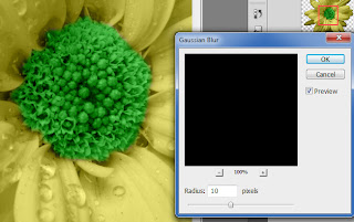
Now go to the top menu and choose "Filter - Blur - Guassian Blur"
Choose a slight blur. Just enough so that it blurs out the edges a bit.
Here I've used 10.
(My Image is 3600x3600 300 DPI so you will need to adjust according to the size of your image)
After you're happy with the above steps choose the bottom layer and hold down the Shift Key.
Click on the Top layer.
This will highlight all of them (as shown above).
Merge them by using the CTRL+E.
It looks nice... But, we're not quite done.
Let's add some shading to the flower.
Duplicate your merged layer (1)
Lock your Transparent Pixels again (2)
Choose the Burn Tool (1)
Choose Midtones from the Range
Choose 50% from the Exposure (Note, most of the time I lower the Exposure to about 30%.
This always depends on the color and size of your area that you're adding shading to.
This always depends on the color and size of your area that you're adding shading to.
You'll want to play with this setting a bit until you like what you see.
That's one reason to duplicate your image.
If you don't like it you can delete it and start over with a new duplicated layer)
Paint with the Burn tool in areas that you want shading to be.
It won't look great at first, but don't worry...
That's why we duplicated the image.
When we're done it will look great!
After you've added your shading, go to the Layer Opacity and turn it to about 32% (1)
(This will depend on what you think looks great).
That's pretty much the basics of painting.
However, there's more you can do to change the appearance.
Highlight both layers and merge them together (CTRL+E)
Now Duplicate these merged layers.
Click on your duplicated layer (1)
Change the Blend Mode to Soft Light. (2)
Notice how it gives it a more vibrant appearance?
Depending on the color you used, the Layer Options you choose from the Blend Mode will change your image appearance.
Play around with it a bit to see the various looks you can come up with.
Here I've added some Inner Shadow.
I chose a color that was a shade darker then the shade I chose for the flower.
I put the size to 250 and the opacity to 37.
I would love to see what you create with this tutorial.
Thank you
Justie
Subscribe to:
Comments (Atom)
Questions or Suggestions?
If you have any suggestions or questions about my tutorials please send me an E-Mail justcreations@ymail.com
Thank you!
Thank you!
Blog Archive
-
▼
2011
(17)
-
▼
March
(7)
- How to Make Swirl Designs (and Freebie Examples at...
- Shading & Highlighting using the Burn & Dodge Too...
- Coloring an Extracted Greyscale Element using Masks
- Coloring without going into the Transparent areas ...
- Create a Paper Bolt Preview - Photoshop Tutorial a...
- Banner
- Embossed Paper - Free Photoshop Tutorial and Full ...
-
▼
March
(7)
Contributors
Powered by Blogger.
Labels
- Banner (1)
- Burn (1)
- Cheat Sheets; Highlights; Shading (1)
- Designer Preview; Paper Preview (1)
- Dodge (1)
- Emboss (1)
- Extraction 1 (1)
- Extraction; Shading (1)
- Freebie (4)
- Freebie; Gold; Tutorial (1)
- Glass (1)
- Glossy Button; Highlight (1)
- Glossy Frame; 3D Shading (1)
- Highlight (1)
- Highlights; Shading (1)
- Lights; Tutorial (1)
- Lineart; Recolor; Shading; Coloring Element (2)
- Lineart; Recolor; Shading; Recolor; Shading; Coloring Element (1)
- Recolor; Shading; Coloring Element (3)
- Shading (2)
- Shapes (1)
- Spherize; Shading (1)
- Swirls (1)
- Tutorial (6)


