Monday, October 17, 2011
First I have to say I do not know what happened to my other blog. I took off some time because of an unexpected health problem and when I logged back in my blog has been deleted. When I asked the person who was helping me she claimed it was done accidently. She meant to write that I wasn't going to be around until I started healing. So, until I figure out how to do a blog it's going to have to stay that way... Anyone know of a good place to get some tutorials on blog? I would love some!!!
Sorry for my absense... I am slowing getting better so I hope to have some more out shortly!
So, on to the tutorial...
Adding Shadows & Highlights to bring life to an image.
Adding Shadows & Highlights to bring life to an image.
Here is what we're going to work on. If you'd like to follow along, you may download this template either here or by clicking on the preview.
This tutorial was created for the sole use of Wilma4ever.
This tutorial was created for the sole use of Wilma4ever.
This tutorial will show you how to take an image and give it some life.
If you look at the monster image you will notice that it appears flat and lifeless.
That’s because I haven’t added any shading or highlights to it yet.
The first thing we want to do is to add some shadow behind the monster.
To do this you will need to activate the monster layer.
Create an empty layer just above the “Inside” layer in the Layers Pallet (this is because we want the shadow to appear inside, behind the monster) (1)
Now while holding down the CTRL key on your keyboard click once on the “Monster” layer. (note: you’ll see the Marching Ants around the monster (2)
Now take your Paint Bucket and fill the area (3)
We now need to blur it out so it will look like a shadow.
Click on “Filter – Blur – Gaussian Blur (from the top menu)
Apply a large enough Radius to your blur until it shows behind the monster (Here I used 91.8, but you’ll need to adjust this if you’re not using my monster template)
Lower the Layer Opacity so that the shadow isn’t too harsh. (I put mine at 62% as shown by the arrow)
Now we want to do the same thing for the Archway (arrow).
I did not show the steps here (for time sake) but all I did was duplicate the Archway layers (since there were many) and merged them together so that we had the archway shadow. I pulled the newly merged layers beneath the Archway and added a color overlay of black.
Now I put an empty layer beneath the Archway Shadow and merged these two layers.
We need to blur this one out as well. However, because the shadow is going to be close to the wall the blur should be a lot less because you’ll notice that the closer the shadow is to the object the harsher the shadow appears. So, I used “Filter – Blur – Gaussian Blur” with a Radius of 36.4.
I lowered the opacity of this layer. Take your Lasso tool and draw around the inside of the archway and all the way through the inside of the doorway. While holding down your CTRL key on your keyboard click X. This will delete any of the shading inside. (We already did that so we don’t want to double do it)
We’ll do the fingers and thumbs now. First we’ll add some shading to the thumb (2)
Find the Thumb Layer in the Layers Pallet and create a new blank layer directly above it. (1)
While holding down the CTRL key click on the Finger layer (3). Using your Paint Bucket, fill this layer with black.
Stay on this new layer and repeat the previous steps for the other 2 fingers.
Apply a Gaussian Blur (I used 58.9)
In order to get the “Overspill” off you will want to make sure that you’re on the shadow layer you just did. (1). While holding down the CTRL key on your keyboard click on the Thumb in the Layers Pallet (you’ll see the marching ants (2)).
At the top filter choose “Select – Inverse” and while holding down the CTRL key press X. This will delete everything outside of the thumb area.
Lower the opacity and rename this layer “Shadow on Thumb”
Follow the same previous steps for the remainder of the fingers and thumb.
You’ll want to follow the previous steps to add the hand shadows on the monster. Make sure to be on the layer directly above the monster. I used a Gaussian Blur of 79.6 for my hand.
Do this for both hands.
Remember to hold the CTRL key down (while being on the Hands Shadow) and click the Monster. Use “Select – Inverse” and CTRL+X to delete any overspill the shadows might have.
Here’s what we have so far. Here I have also created a shadow from the Archway directly onto the monster. The reason I did this one separate from the first archway shadow is that I wanted this shadow to appear softer and further out so it would give depth between the monster and the archway. Use the previous steps we did for the archway, but this time make sure that you only leave the shadow on the Monster himself and the inside of his tail (I used a soft eraser to erase everywhere on the tail but the inside curve.
Notice how the eyes appear dull and lifeless… We can’t just add a shadow to these. We also need some light so it helps bring personality to the monster.
Using the Ellipse shape tool, create a shape (with white) around his eye as I have here. Duplicate this layer and change the color to red (or whatever you want, we’re using this as a guide and it will be deleted when we’re done.
Bring it down and widen it out as I have here. Make sure that you rasterize the white layer. (Right click over the layer and choose “Rasterize Layer”) Turn this “Red” layer off (Uncheck the eye to the left of the layer)
Click once on the white layer and holding down your CTRL key click once on the Red layer. Still hold down your CTRL key and press X to delete part of the white.
This will leave you with a nice white highlight on the top of his eye. Go to Gaussian Blur and apply a very small radius (1 or 2). You want to do this so that it softens the highlight just barely.
Do the same exact thing for the Iris.
Create a small round dot for the Pupil. This will be the Catchlight. You don’t need to blur it out. You can lower the opacity if you don’t like how bright it appears.
We now want to add some shading to the eye. Go to the Layer Style option box and choose Inner Shadow. Put the Blend Mode to Multiply and play with the settings until you have a nice shadow around the eye. I used 38% Opacity, Distance: 5 and Size 59.
Do the same thing for the other eye. I also added a highlight to the top of the nose to help it appear more 3D.
Now we’re going to bring the flame to life.
Using your Ellipse shape tool draw a round circle below the flame. Make sure to rasterize this layer.
Apply a Gaussian Blur to this. I used 89.0
Lower the opacity. I used 48%
Because the steps are the same and I didn’t want to be redundant I will just say that you need to apply a shadow layer to the flame using the steps above (be sure to include the flame itself as well as the base)
Since this is so close to the wall we don’t want to apply the shadow the same way we did before. We want to add more of a perspective blur to the shadow. To do this we would use the Transform tool (CTRL+T). While holding down the CTRL key you would grab the top and drag it to the right and down a bit so that it looks like I have it here.
Now we’ll add a slight Gaussian Blur to it. I used 5.7.
Lower your opacity.
Now we need to shade the monster. I’m going to be using black as my shading since I’m leaving the monster grey so that it will stand out better for the tutorial.
Go to your Inner Shadow and add a darker shade of the color you chose for the monster. Play around with the size and opacity until you like how it appears. I used the opacity at 63%, the Size at 76 and the distance at 5.
I’m going to show you how to color the flame in (It’s hard to shade this unless it’s colored so this will be the only thing I do with color).
I added a Yellow color overlay to the flame itself and then went to the Inner Shadow and applied the color F4A100 (Orange). I put the size so that it showed softly on the edges.
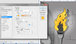
 Go to Inner Glow; change the Blend Option to Multiply. For Source, choose Center. Add the same orange you used for Inner Shadow. Use 250 for Size and 67% for opacity.
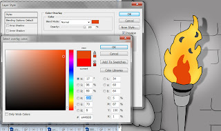
Go to the middle Flame and use E44608 for the Color Overlay.
Go to the Inner Glow and change the Blend Mode to Multiply. Use the color C03701 and put the opacity at 75% and change the size to 114.
Go to the Outer Glow and change the Blend Mode to Multiply. Use the color red and put the opacity to 41%, the Spread to 7 and the Size to 133.
That’s it…
Here are my “Before – After with Shading and After with color”
If you’d like to have this template you can download it here.
This tutorial was created for Wilma4Ever. All rights to the template and tutorial are for their use.
Subscribe to:
Post Comments (Atom)
Questions or Suggestions?
If you have any suggestions or questions about my tutorials please send me an E-Mail justcreations@ymail.com
Thank you!
Thank you!
Blog Archive
Contributors
Powered by Blogger.
Labels
- Banner (1)
- Burn (1)
- Cheat Sheets; Highlights; Shading (1)
- Designer Preview; Paper Preview (1)
- Dodge (1)
- Emboss (1)
- Extraction 1 (1)
- Extraction; Shading (1)
- Freebie (4)
- Freebie; Gold; Tutorial (1)
- Glass (1)
- Glossy Button; Highlight (1)
- Glossy Frame; 3D Shading (1)
- Highlight (1)
- Highlights; Shading (1)
- Lights; Tutorial (1)
- Lineart; Recolor; Shading; Coloring Element (2)
- Lineart; Recolor; Shading; Recolor; Shading; Coloring Element (1)
- Recolor; Shading; Coloring Element (3)
- Shading (2)
- Shapes (1)
- Spherize; Shading (1)
- Swirls (1)
- Tutorial (6)


0 comments:
Post a Comment