Friday, July 22, 2011
How to extract an element from a photograph
If you want to follow along with me you can download this image here. (It will have the finished element as well as the image used).
There are many ways to extract something from a picture. I’m going to try to make several tutorials showing you various ways. This way is going to use the Polygonal Lasso Tool.
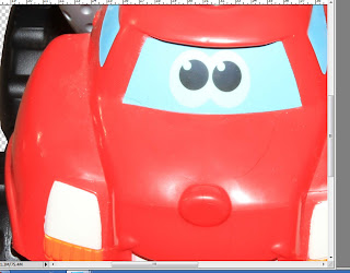
We’re going to extract my grandson’s truck from this picture. The first step is to double click on the Layer Thumbnail in the Layers Pallet (See Arrow)
When the New Layer box pops up, click OK.
Grab the Polygonal Lasso Tool (1) and draw a rough line all around the image you’re extracting. (2)
While holding down your CTRL key on your keyboard press J to duplicate the area you drew with the Polygonal Lasso Tool.
Turn off the bottom layer so you just see your newly cut area.
While still using the Polygonal Lasso Tool (1) very carefully go around your truck and the area you do not want to be in your element. (2). You should do this in smaller sections just in case you make a mistake.
When you have an area ready to go press X on your keyboard while holding down the CTRL key. (You can also simply hit delete on your keyboard.
You will have to be very careful of the hidden areas like I have here. You don’t want to miss them. I always zoom in at 100% just to make sure I don’t miss anything.
So far so good? Even though you can’t see it there might be some left over portions you don’t want. We need to add a stroke to find them.
Double click on the Layer Thumbnail to bring up the Layer Style Options. Choose Stroke and choose a color that’s totally opposite of the item you’re working on. Since there isn’t blue on my truck I chose it. Put the size to at least 10. (Depending on the size of your image). Click OK. Now go all around your image to make sure there aren’t any spots or parts. Clean them up the same way you did above using the Polygonal Lasso Tool. When you’re done with this simply do a Right Mouse Click over the Layer in the Layers Pallet and choose “Clear Layer Style”.
Now notice how other items that were in the picture are causing the color problems for the truck (the tire has red and yellow colors on it). (1)
We want to use a couple tools to fix this but we don’t want to cause Spill Over into the transparent part of the image so we need to Lock the Transparent Pixels. To do this, simply push in the Lock icon on the top of your Layers Pallet (while on the layer you want locked). (2). Now we can paint and not worry about painting in the transparent part of the image.
Grab your paintbrush (1). Change the Mode to Color (2) and the Opacity to% (3). Before you start painting you’ll want to hold down the ALT key on your keyboard. This will change the curser into the eyedropper. Simply click on the color you want to paint with. This is called Sampling. You’ll want to do this many times as you’re painting since even the red has various shades of it. Now simply start painting in the areas you want to fix the colors of.
There is one problem with doing this and that is with the colors Black and White. They don’t turn out nice. Notice how my tire turned out grey instead? These colors are better done using the Burn and Dodge Tools.
For Whites you’d want to use the Dodge Tool with the Range at Highlights and the Exposure at 50%
For Blacks (which we’re doing) you’ll want to use the Burn tool (1) with the Range at Midtones (2) and the Exposure at 50%
Now go over the tires until you like how they appear. Here is my results.
Once you’re satisfied with the edges you’ll want to check for blown out highlights. Notice how the flash of my camera put the highlights on the truck? Though you want catchlight’s in people’s eyes, you don’t want this on your elements. We can easily fix this with the Patch Tool
Grab your Patch Tool and make sure that Source is checked (top menu bar)
Draw around the blown out area (1). Drag this to an area that is perfect (2) and release.
See? Much better… Now continue doing this for the remainder of your image where it needs fixing. Sometimes it’s not blown out highlights but dirt or ??? (I have to say, I’m amazed at the stuff my grandson gets in his toys… cookies… you name it) LOL!!
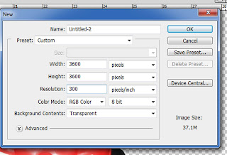
When you’re done it’s time to create a new image to pull this into. Your photograph will be at 72 DPI but for scrapbooking people use 300DPI. So I created a new image 3600x3600 300DPI.
Now you’ll want to grab the Layer Thumbnail (1) of your image and drag it over to the new image (2).
The next step is to trim away all the empty space outside the truck. To do this you go to Image – Trim from the top menu bar.
When the dialog box opens make sure it looks like this one and click OK.
Looks better… Not so much empty space… Now we’re going to fix the coloring
(BTW… I didn’t take time to do the rest of the blown out highlights for this tutorial because I wanted to make sure it was online)
Now from the top menu bar choose Image – Adjustments – Hue/Saturation
Make sure that Colorize is not checked and that Preview is.
Play with the sliders until you like the results.
Here is my finished image. You can download my finished element here. (BTW – you’re welcome to use this as CU4CU or anyway you’d like. I do not put restrictions on my extracted elements).
Thursday, July 21, 2011
Making something appear glossy.
Today I’m going to show you how to take an element and make it appear as if it’s glossy instead of flat. I did this with a button in a previous tutorial but this time I’m going to show you a bit more.
If you’d like to download the template that goes along with this tutorial you can do so here!
First open your image. If you’re not using the template that goes with this tutorial you’ll want to adjust the sizes according to what looks best with the size of your image. The size of the template I’m using is 3600x3600 300 DPI.
Notice how the frame appears flat? We’re going to fix this… But first... a slight lecture ;)
When I first started doing this I asked my husband what was wrong with my images, why did they appear flat looking… He gave me a lecture on lights and shadows… I’m going to give you the condensed version because it changed how I look at everything.
In order to make something appear 3D you have to have both shadows and lights. If you only had shadows it would appear too dark and flat. If you had too much light it would appear too light and still flat. You wouldn’t be able to see definition. So… take a ball or something and set it by a window and watch how the sun lights up part of it and the shadows appear on parts of it. Now shut the blinds and turn off the lights and you’ll see how you can’t define the ball… Take the same ball and place it directly in the sunlight and you’ll see how the light makes it too hard to define… Also, when doing this notice that some of the highlights are softer and some are not. This is because the closer the light to the object the harsher the highlight will appear. The same theory goes with the shading.
Ok… lecture over… let’s get back to the tutorial.
We’re going to add some highlights first. Grab your Ellipse tool and draw a white (FFFFFF) circle out just slightly larger than the hole. (Hold the shift key down while drawing out the shape to get a perfect circle).
While holding down the CTRL key on your keyboard press the J to duplicate your new shape.
Change the color to any color you want (it doesn’t matter what color you use since we’re only using this as a guide and it will be deleted when we’re done).
Move this new shape up a bit so that you see the highlight as I have it shown.
Do a right mouse clock over both shapes in the Layers Pallet and choose "Rasterize Shapes"
Turn off this shape (2). Now go back to the highlight (1) and click once to make sure you’re on this layer. Now while holding down the CTRL key on your keyboard click once on the duplicated shape (2). This should activate your shape (Marching Ants) (3).
Now while holding down the CTRL key on your keyboard press the X (Cut). This will delete the active part and leave a nice shape for the highlight.
Rename your new shape to Frame highlight and duplicate this layer (CTRL+J). (1 and 2).
Now go to the second highlight (2) and transform it (CTRL+T). Once you’ve done that do a right mouse click over the image and choose “Rotate 180 from the menu (3).
Since it’s now a bit too large for what we want we will click on the layer and while holding down the CTRL key on your keyboard click once on the layer thumbnail in the layers pallet to activate it.
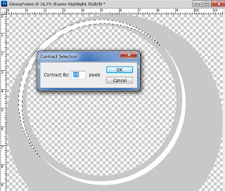
Now from the top menu choose Select – Modify – Contract and enter 15.
Now choose from the top menu Select – Inverse and while holding down the CTRL key on your keyboard press X. This will delete the outside of the highlight so it will be shrunk in some.
Now we want to blur out this new smaller highlight. Choose from the top menu “Filter – Blur – Gaussian Blur” and choose 3. Click OK.
Now we want to blur out the larger highlight. Choose that layer from the layers pallet and choose Gaussian Blur from the Filter menu again but this time choose to blur it by 6. Click OK.
Now we want to add some color to the frame. Double click on the layers thumbnail in the Layers Pallet (see arrow) to bring up the Layer Style Option Box. Choose the Color Overlay and choose a color you like. We are not done though… Now we’re going to add the shading.
Choose Inner Shadow and choose a slightly darker shade of the color you chose for the Color Overlay. Now make sure that your Blend Mode is on Multiply and put your Angle to 120, your Distance and Choke are both 0, and your Size is 250. Now we want to go to the Inner Glow section.
From here we want to use the same color you chose for the Inner Shadow. Change the Blend Mode to Linear Burn and put the Opacity to 31. Make sure your Choke is at 0 and put your size to 250. Now you can click OK.
If you turn off both the Frame Highlights in the Layers Pallet you’ll notice how it appears 3D but not glossy. This is because you’ve added the shading around the edges and the top part is lighter so it will serve as the highlights… This is fine if you are not wanting a more shiny look.
Turn back on your Frame Highlights. Notice the difference?
So now we want to add a bit of soft highlighting to the frame. Using your Ellipse shape tool draw out an oval in white as I have done here.
Now from the top menu choose Filter – Blur – Gaussian Blur and put the size to 250. Click OK.
Turn off this new shape (1).
While still on this layer (1) hold your CTRL key and click once on the Layers Thumbnail (2).
This will activate your layer (Marching Ants).
While holding down the CTRL key press J to duplicate the shape in the activated shape. (Marching Ants). This will cause the highlight not be spilled over into the transparent parts of the image.
Rename this layer to Frame Highlight 2. Go to the Layers Blend Mode and change it to Soft Light (1). Now lower the opacity to 50% (2).
That’s it… your frame should appear as if it’s 3D and glossy.
Downlad my example and the Template to follow along here!
I would love to see what you’ve created using this tutorial.
Thank you!
Justie
Subscribe to:
Comments (Atom)
Questions or Suggestions?
If you have any suggestions or questions about my tutorials please send me an E-Mail justcreations@ymail.com
Thank you!
Thank you!
Blog Archive
Contributors
Powered by Blogger.
Labels
- Banner (1)
- Burn (1)
- Cheat Sheets; Highlights; Shading (1)
- Designer Preview; Paper Preview (1)
- Dodge (1)
- Emboss (1)
- Extraction 1 (1)
- Extraction; Shading (1)
- Freebie (4)
- Freebie; Gold; Tutorial (1)
- Glass (1)
- Glossy Button; Highlight (1)
- Glossy Frame; 3D Shading (1)
- Highlight (1)
- Highlights; Shading (1)
- Lights; Tutorial (1)
- Lineart; Recolor; Shading; Coloring Element (2)
- Lineart; Recolor; Shading; Recolor; Shading; Coloring Element (1)
- Recolor; Shading; Coloring Element (3)
- Shading (2)
- Shapes (1)
- Spherize; Shading (1)
- Swirls (1)
- Tutorial (6)


